Hi, I’m Ed Walker — a Senior UX Designer & Researcher with over 25 years’ experience. Delivering clear, human-centred digital services. I blend design thinking, research, and collaboration to create intuitive products that meet real customer needs and business goals. I’ve led UX projects that make data, decisions, and processes easy to navigate. My approach is grounded in evidence — real users, real insight, and measurable outcomes. Whether I’m running discovery workshops, mapping customer journeys, or building prototypes, I work closely with teams to uncover what matters most to users and deliver designs that genuinely make a difference.
I’m currently open to full-time opportunities (and short-term contracts) across the UK — hybrid or remote.
Let’s chat about how I can help your team design with confidence.
Talk to me.
October 2022
Senior UX Designer
Tools Used:
Figma, Confluence, Asana, Teams, Powerpoint, Copilot
Techniques Used:
Stakeholder Interviews, SME Interviews, Workshops, Personas, Flows, Wireframing, Prototyping
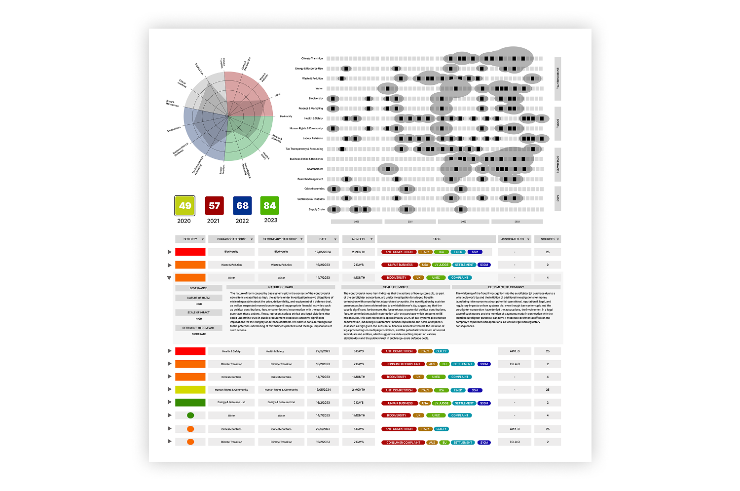
Controversies Workspace Proof of Concept
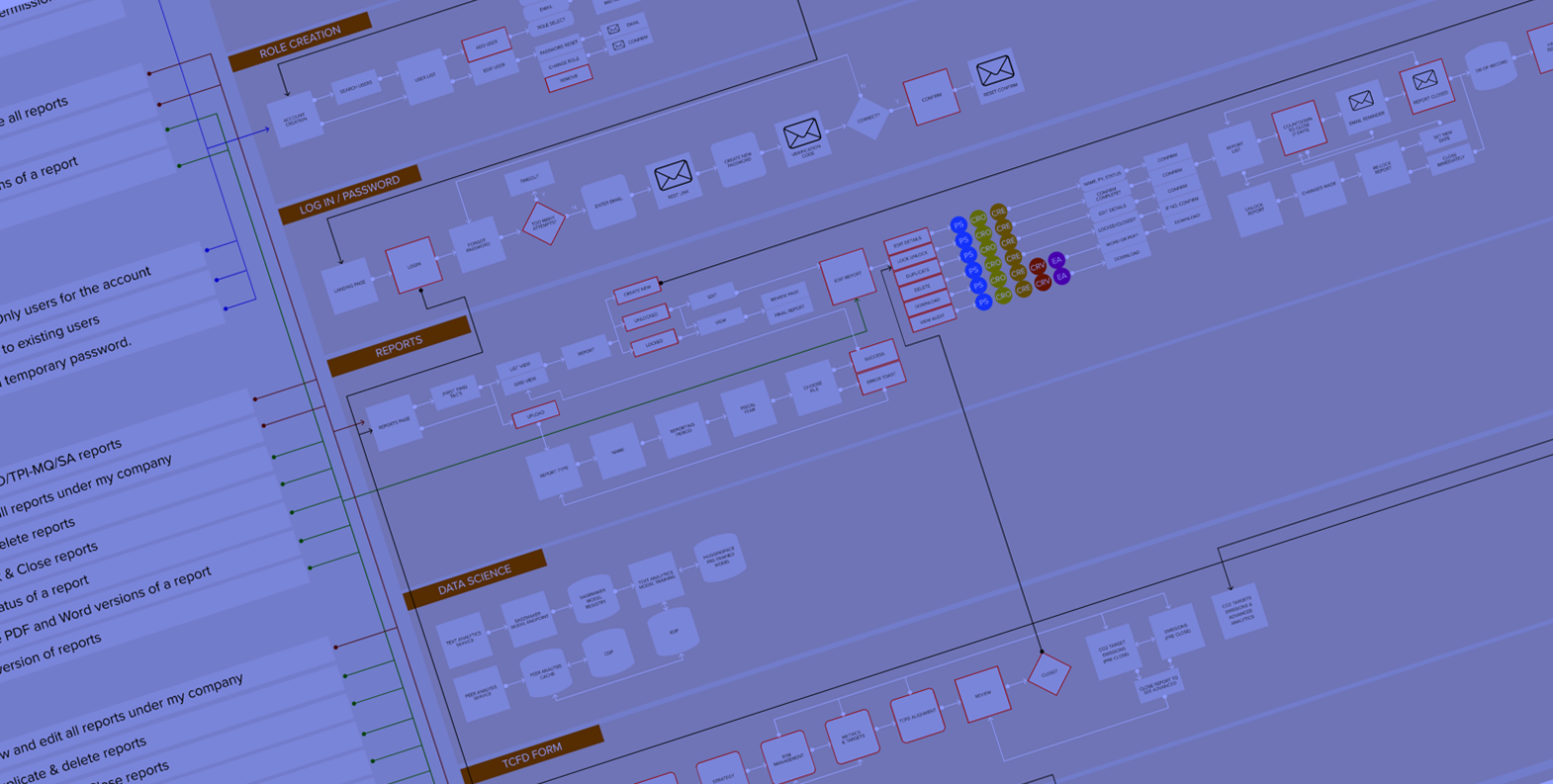
Working in the SFI Labs division I helped create cutting edge AI analytics tools for sustainable finance both on and off LSEG’s Workspace platform. Engaging in UX research into complex topics to provide insight in how we could use LLM’s to provide products for Green Bonds, Controversies, Product Involvement and Carbon Disclosure. Presenting reports and working with Product Owners to develop Flows, Wireframes and Prototypes to produce proof of concept ideas for the business.
Drop me a line to see my LSEG Case Study.
Personas and Flows for Sustainable Growth product
April ‘21 - July ‘22
Senior UX Designer
Tools Used:
Figma, UX Tweak, Excel, Zoom, Slack, Jira
Techniques Used:
User Flows, Wireframing, Prototyping, Design System, User Testing
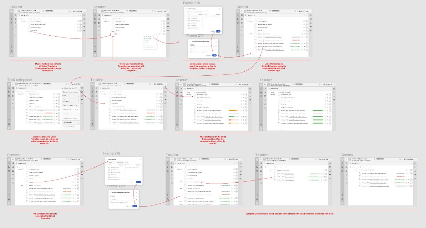
Cutover is a work management platform for hugely complex operational resilience, application release orchestration and cloud migration projects. Their clients number some of the biggest financial corporations in the world and the projects, known internally as Runbooks, can number thousands of individual tasks for global mission-critical projects such as ATM network failures. Runbooks often comprise hundreds of members in numerous teams, integrate with external systems and give real-time reporting on the status of the project. It’s immensely complex UX and something which has been highly enjoyable to work on.
Because of client confidentiality I can’t outline the specific projects I worked on here but drop me a line to see my Cutover Case Study.
April ‘17 - August ‘20
UX Director
Tools Used:
Sketch, Adobe Suite, Craft, Zeplin, Lingo App, Slack, Zoom, GA
Techniques Used:
Stakeholder Interviews, Benchmark research, GA Analysis, 3 in a box, Wizard of Oz, Personas, OOUX, User Flows, Wireframing, Prototyping, Design System
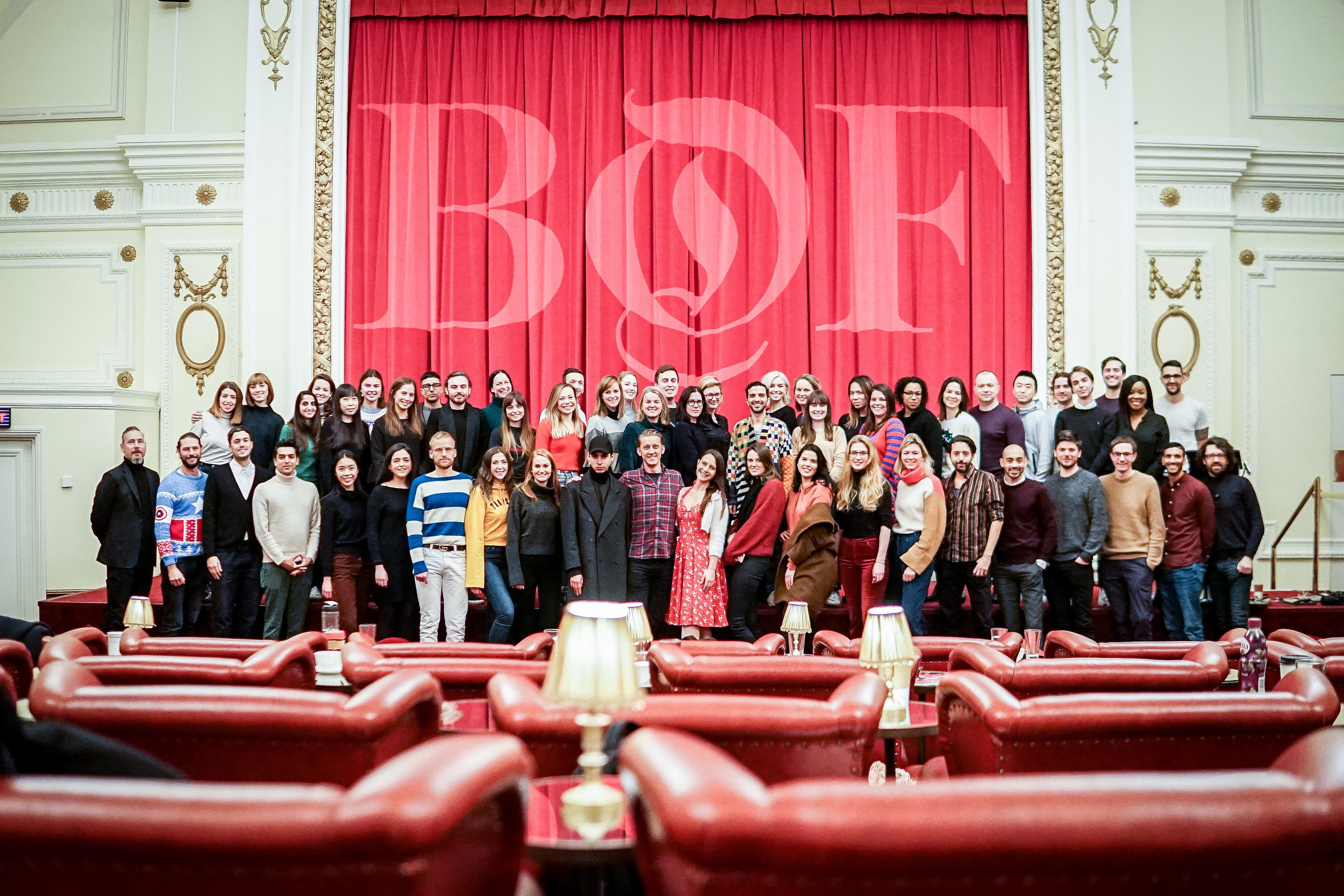
I joined BoF in April 2017 as Senior UX Designer, in January 2018 I was made Design Director and in June 2019 I changed my role to UX Director. In my time here I have hired 5 members of staff, 3 of which are still with the business, spearheaded the development of the BoF Design System, embraced usability testing, OOUX and other agile techniques, refocused the persona development and shaped the user experience strategy of the product team. My role now is to increase transference and consistency throughout the BoF product portfolio and help steer the company in a more customer led direction. Below are some of the highlight projects I’ve led while working for this truly groundbreaking company.
BoF Design System
The BoF Design System has been a long time coming, the everyday tasks, resource and competing initiatives have thwarted its development but in 2020 it will get its first real rollout to the business. Working with the Studio Team to incorporate the new style-guide work and the development team to implement our new patterns in new development work we will start to see the impact of all the hard work in consolidating and removing inconsistency.
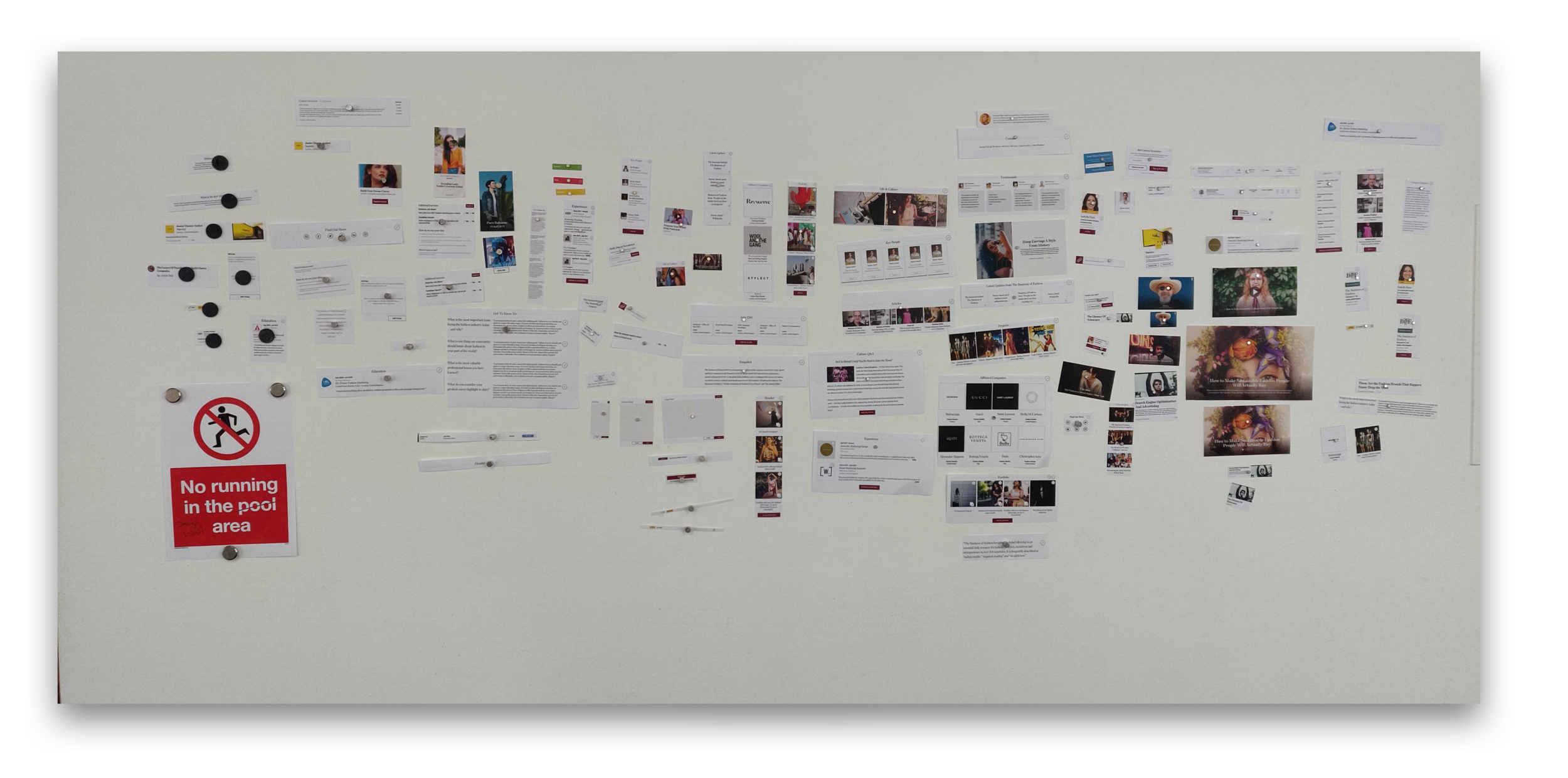
Breaking down the modules we use on the BoF site in both Mobile and Desktop
Un-Design
There are a great deal of initiatives that the development team are working on and a full redesign of the site, whilst much needed, is not currently possible. As a interim measure we recently worked on an ‘UnDesign’ of the current homepage and article page. Even though fully paying back technical debt is not possible right now we have slimmed down the homepage, removed underperforming modules and made the homepage shorter based on heat/clickmap data. In up coming stages we will further reduce the elements on the page, swap out expensive and slow loading custom fonts and speed up the page load time. Using Hotjar we will track the performance of this newly slimmed down page and it will give us invaluable data on how our customers use our site in readiness for a full redesign in 2020. You can read about the process here.
One of the slides in the Un-Design Deck looking at benchmarks’ homepage loading times and and scores
BoF Company Pages
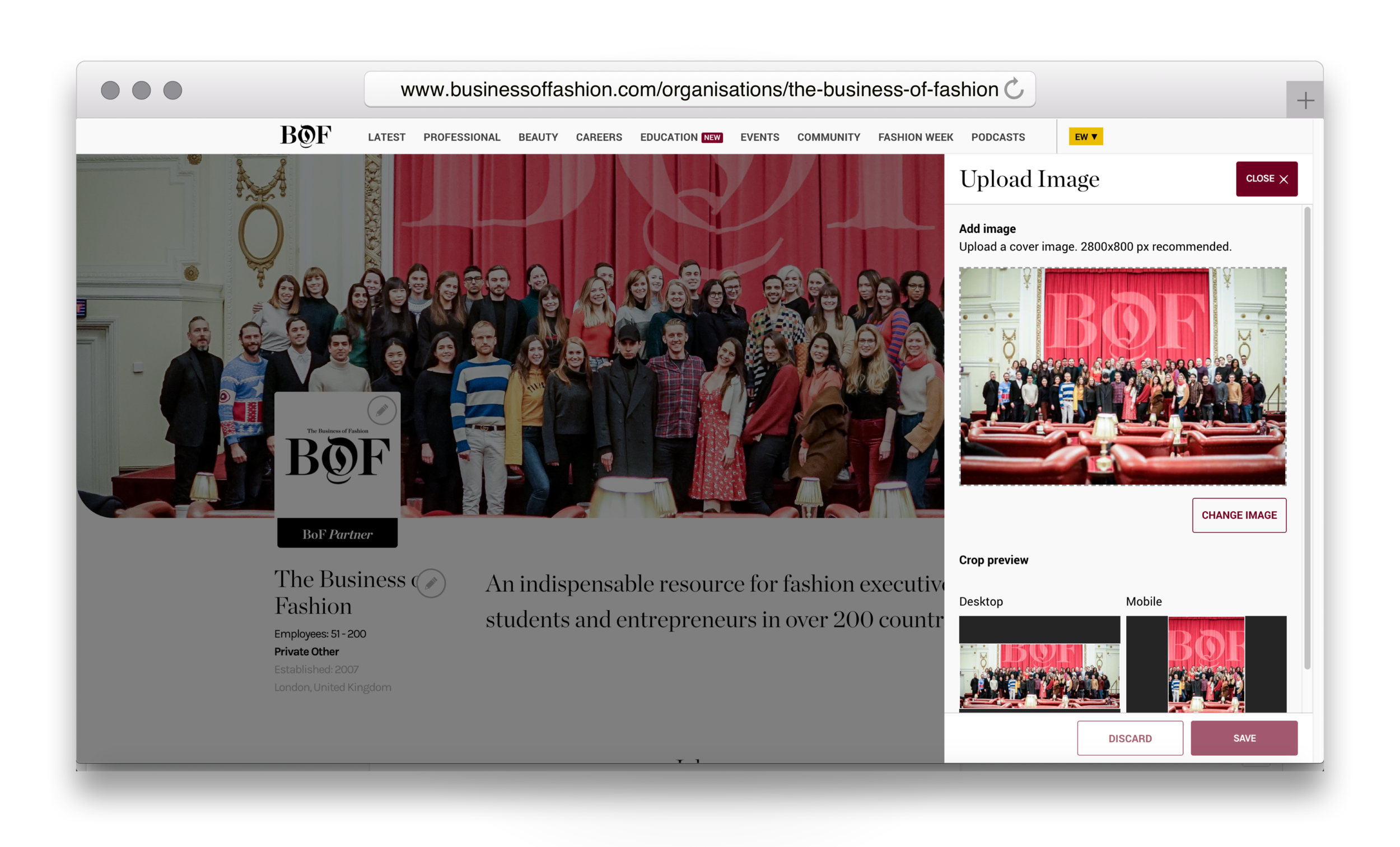
BoF Careers offers companies who advertise jobs on our service pages that allow them to not only advertise their jobs but also the company culture. The existing pages were built a long time ago and desperately needed a redesign so they performed better on mobile and gave the companies a better platform to promote themselves. Using OOUX techniques to identify the components we worked mobile first and created use cases, personas and wireframes. Particular attention was given to the edit flow which needed to be simple but sophisticated. The old pages were difficult to edit which meant that companies rarely came back to update their information, the new flow was simple and easy and has increased updating enormously.
BoF company page for AllBirds
The BoF company page edit module
BoF iOS App
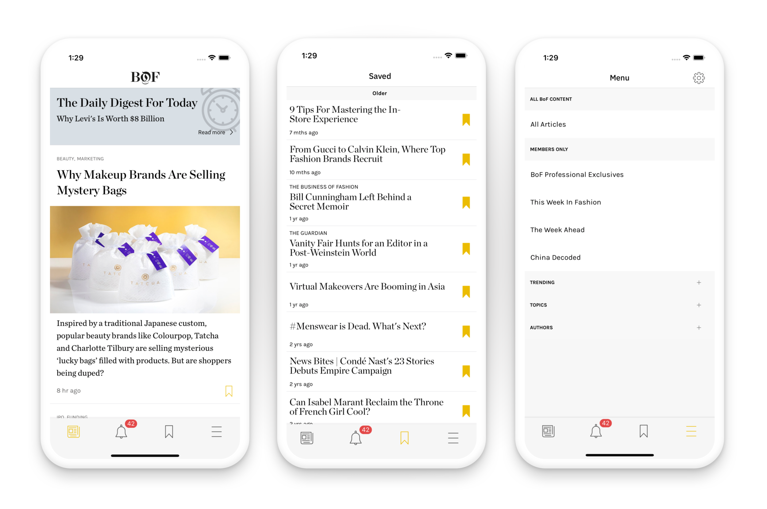
The BoF iOS app is a member only exclusive but was built on web app technology. Poorly thought-out UX and slow performance always stunted it adoption. Last year we started working on a truly native solution that not only improved performance and brought the style of the app upon to date incorporating some new typography ideas and article presentation. Eventually members will be able to manage their job applications, continue any Education courses they have subscribed to and take full advantage of their subscription from within the app.
The brand new BoF iOS app
Building a team
When I joined BoF there was a Junior Designer and a Print Designer on the team. Soon after I joined the Junior Designer left to go back to school and I was working on the UX and marketing assets alone. Over the next two years it was one of my main tasks to build out a fully fledged design team and when I was made Design Director I put my full focus into the task. Over the period of two years I hired an Intern, two UX Designers, a Mid Weight Marketing Designer and an Art Director. In July 2019 we hived off the visual design part of the team and formed an in-house Studio which allowed all of the creative staff such as podcast, video and copywriting to work closer together. Myself and a UX Designer formed the UX Department and now I can focus purely on the user experience of the product, a full two and a half years after joining the business.
UX Strategy
Our Head of Product Emily Penny talking to our Developers in Slovenia
Like most businesses BoF has limited resources and prioritising UX research, proper product ideation and testing is always a challenge. Over the past year I have been proactive in working with the different departments around the business to promote and communicate good UX processes. I work closely with the Head of Product, CTO and product managers to effectively pipeline the correct amount of time that is needed for the most important projects and streamline the UX process for the projects which need to be delivered as quickly as possible. In essence, it’s all about looking forward, identifying the direction of the different areas of business and being ready to give the most value to any development the business does. The design system has been instrumental in this process but good old fashioned communication, listening and joining up the dots makes this seamless. I make it my mission to regularly talk to all the heads of departments and find out what future plans they have inked or simply just thinking about and find crossover and build in duel purpose concepts that save the business time in the long run.
August 2015
Contract UX Designer
Tools Used:
Axure, Skype
Techniques Used:
Stakeholder Interviews, Skype Calls with Developers, Axure Prototyping
Redacted Education Company
I contracted for a global education company to create a tool which at first seemed impossible to create.
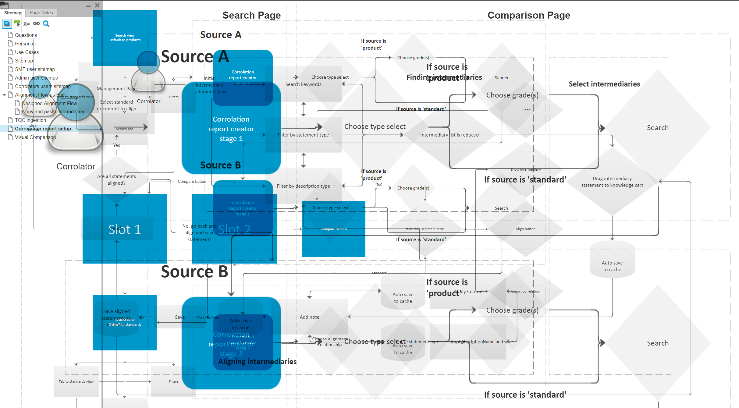
Using Axure we created a prototype so the developers could really understand our UX
They publish hundreds of school textbooks for countries who all have different grading systems and syllabuses, the problem was that a huge amount of the work was overlapping and effort was being duplicated time and time again.
One of the flows that illustrated the comparison logic
They needed a tool to compare textbooks from one country with another. In short it was the most complex UX problem I’ve ever tackled and through the hard work of a multinational team, communicating every day via Skype we worked tirelessly to create a web based tool. It allowed us to put two different countries grading systems side by side and align them so that textbook editors could automatically reconfigure books to work in multiple countries. It literally saved them millions of dollars.
An increbible contract, working with really talented people in a really short timeframe.

May 2015
UX/UI Contract
Tools Used:
Adobe Suite, Axure
Techniques Used:
Stakeholder Interviews, Wireframes, Prototypes
Logo variations for First Freelance
When I was approached by First Freelance they had a brand style which had been designed for them and they had been using for sometime. Their brand needed some refining but mainly it needed greatly expanding. I worked to create a new colour palette and logo variations led to a full style guide of photography recommendations, social media templates and a completely new website.
The desktop view of the new site
For a great deal of the time I worked in house collaborating with Mark and Carlo, the company’s leads to create a fast turn around on numerous projects. It just goes to show that when you are working with business owners who are passionate and motivated you can achieve so much more than working in an agency or remotely.
Printed promotion that carried the refreshed brand

December 2014
UX Contract
Tools Used:
Adobe Suite, Axure, Cushy CMS, Skype
Techniques Used:
Stakeholder Interviews, Axure Wireframes & Prototypes, 3 in a Box with Developer, Cushy Implementation
The most beautiful thing about cinema is there is no shortage of stunning images to use. It was from this baseline that I completely redesigned the mobile and desktop experiences and at the same time incorporating a large CRM system for arts cinema Whirled.
The wireframe of the Whirled Cinema website
Using the ever changing imagery of that week’s movie I filled the screen much like the experience of going to the cinema and then let the content scroll over the top of the image and used it to create texture for the page.
The finished Whirled website
The mobile view of the Whirled site
Working with the founders we identified the personas and streamlined the user journeys to allow existing members to quickly find out what was showing whilst at the same time enticing new members to join.

February 2014
Senior Designer
Tools Used:
Adobe Suite
Techniques Used:
Stakeholder interviews, Benchmark research, Paper visualisation, Preparing artwork for print
I moved to Edinburgh to work for startup FreeAgent who create online accounting software that had rabidly passionate customers who pushed their NPS score up in the 60’s.
Magazine ad designs for the new service
I created a campaign to promote Freeagent to accountants to start using the software with their customers, saving them time and allowing them to do what did best, advising their clients on how to best structure their accounts rather than adding up receipts.
Trade show swag
We created a new sub-brand of FreeAgent, advertisements, event stands and other promotional material.

June 2015
UX Contract
Tools Used:
Axure, Skype
Techniques Used:
Stakholder Interviews, Persona Creation, Empathy Maps, Use Cases & Flows, Axure Prototypes
I was introduced to Hamish at Bridebook by my good friend Aimee, who I worked with at Immediate. I worked with Hamish to create the UX for the new service which would combine wedding planning tools with an online directory of suppliers.
Personas for Bridebook
We created personas, empathy maps and flows to work out the optimal experience baring in mind multiple people will be logging into one account, bride, groom and even the bride's mother.
One of the Empathy Maps for the Bride
Numerous tools had to be designed, as well as a comprehensive search. I had been working on You and Your Wedding whilst at Immediate Media and this came in very handy, especially creating the search UX.
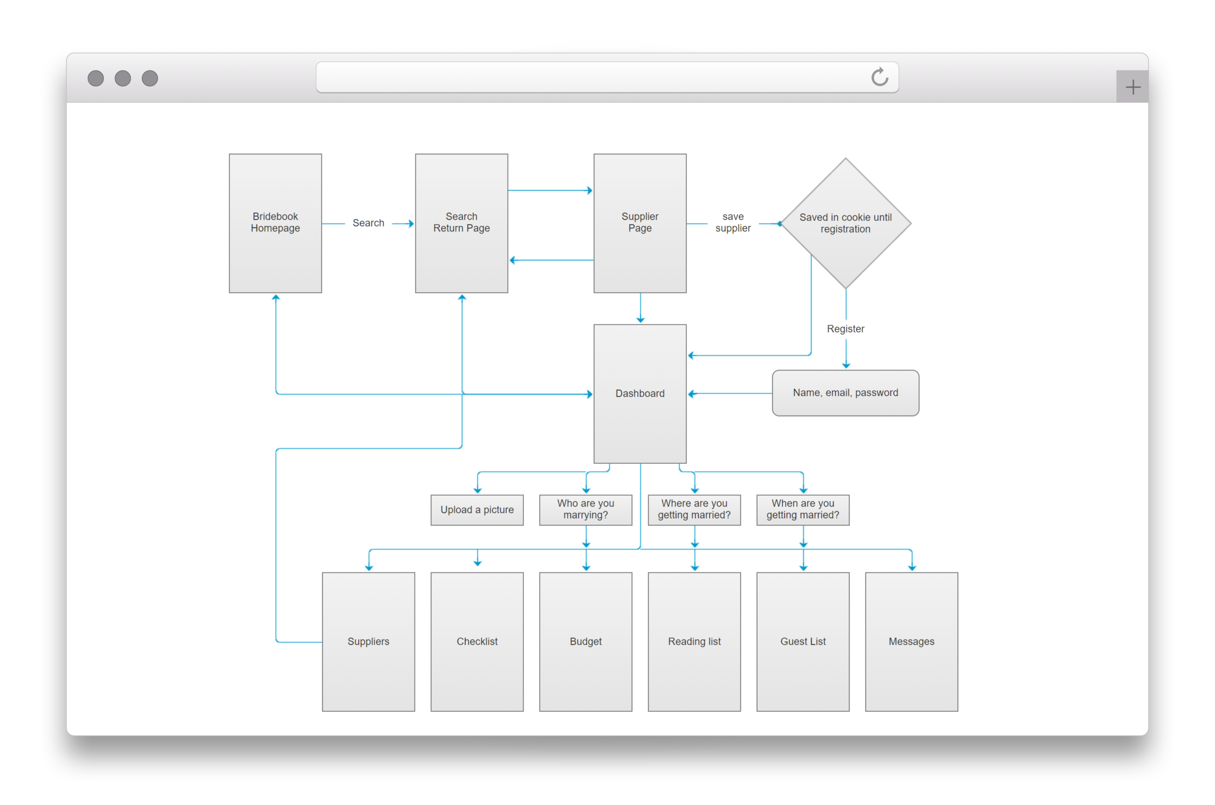
Flows for the dashboard of Bridebook
Working with such a dynamic team who were incredibly engaged was a delight and the site went onto the be design by my very good friend Danielle Self.
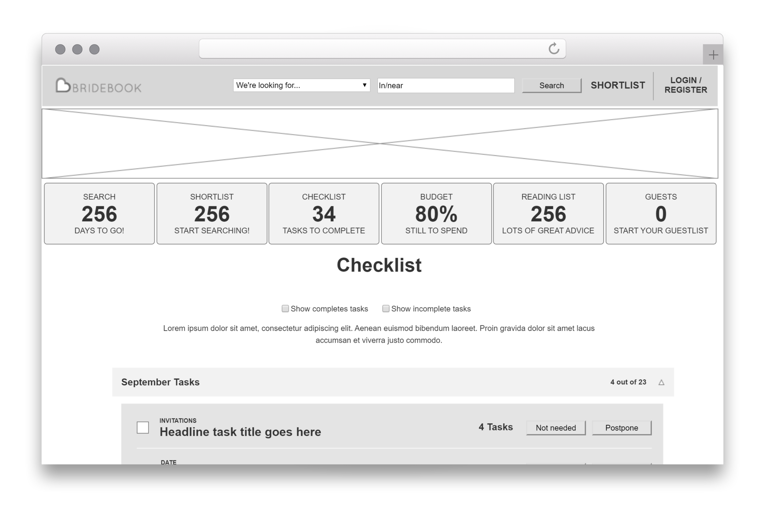
An early wireframe for the Dashboard
May 2012
Senior UX Designer
Tools Used:
Adobe Suite, Axure
Techniques Used:
Stakeholder Interviews, Wireframes, User Flows, User Testing
The RadioTimes iPad app
When I joined the company they had just acquired the BBC magazine contract. It was my job to bring proper UX methadologies to the sites to revamp the usability and increase the revenue whilst still promoting the magazine business. We created a distinct User Experience department, made platform wide changes to the sites and even created a carpeted user testing lab with a sofa and two way mirror. It was here that I fleshed out a great deal of my previous e-learning techniques to create Stakeholder interviews, UX research, Personas, Emotion Mapping, Wireframing & Prototyping, UI design and User Testing. Working on fascinating projects like the Radio Times iOS app and iPad Edition of the Christmas Issue it was never dull, even on the Gardeners World plant e-commerce site.
Your and Your Wedding Venue finder and the Radio Times Travel site
August 2008
Senior Designer
Tools Used:
Adobe Suite
Techniques Used:
Wireframing, Prototyping, Agile Development
Nuts.co.uk responsive layout
I moved to IPC to work on the men’s lifestyle sites after initially redesigning NME.com. I moved onto working at Nuts.co.uk and worked in a team that took the site from 10 million to over 150 million page impressions a month and netting the business a million pounds a year.
It was also the first time I worked on an agile project to re-design Mousebreaker.com which had been newly acquired by the business. We took a flash player and embedded it into a blank page and designed the website outward around it.
Mouse breaker with a SSX takeover
July 2006
Web Designer
Tools Used:
Adobe Suite
Techniques Used:
Stakeholder Interviews, Wireframing, HTML Coding
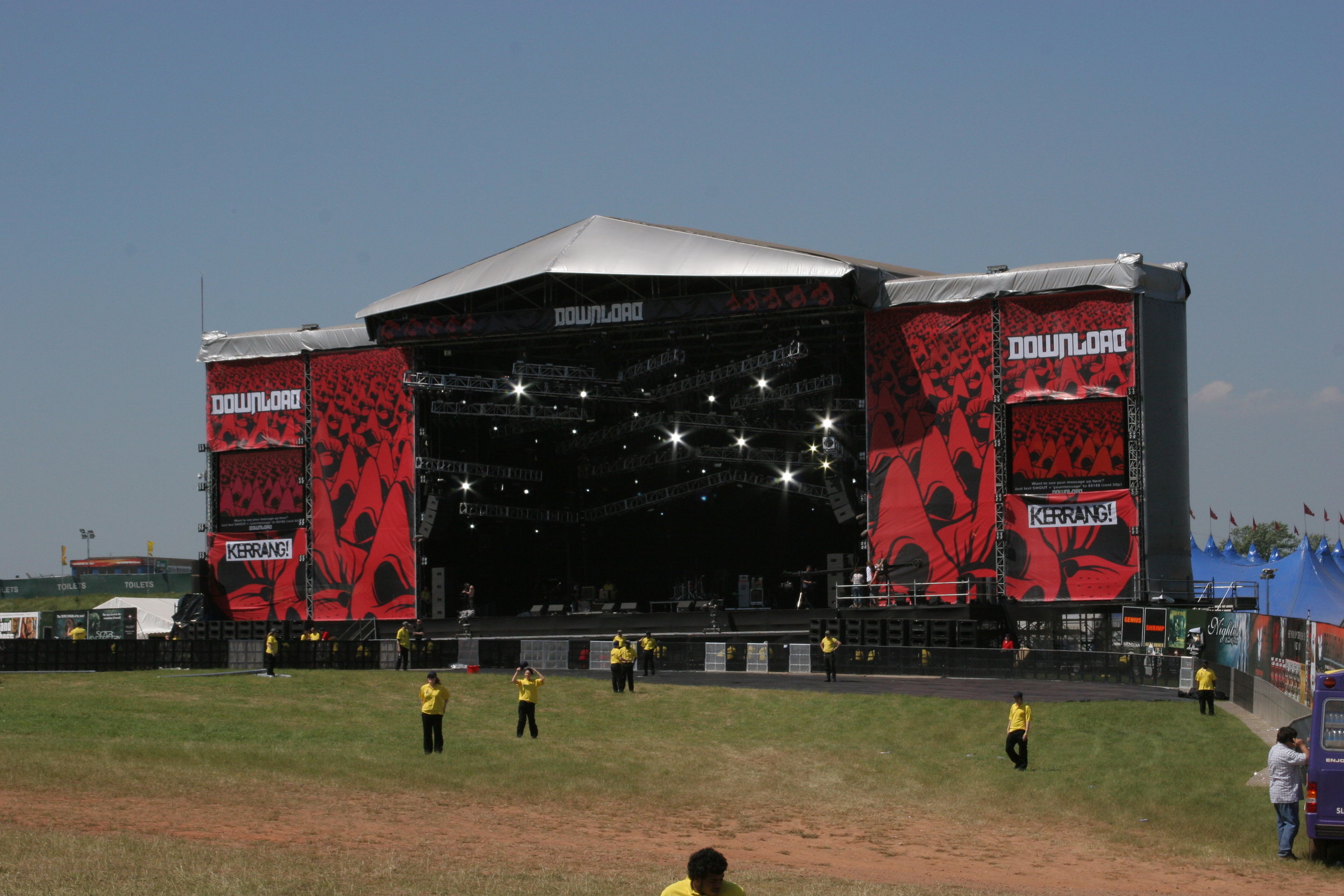
In the early days off online ticket sales Livenation set up a web division to create sites for its live shows and festivals such as Wireless and Download. We created sites that advertised the festivals and allowed customers to buy online way before Glastonbury had a meaningful web presence and the explosion of the festival scene in the UK.
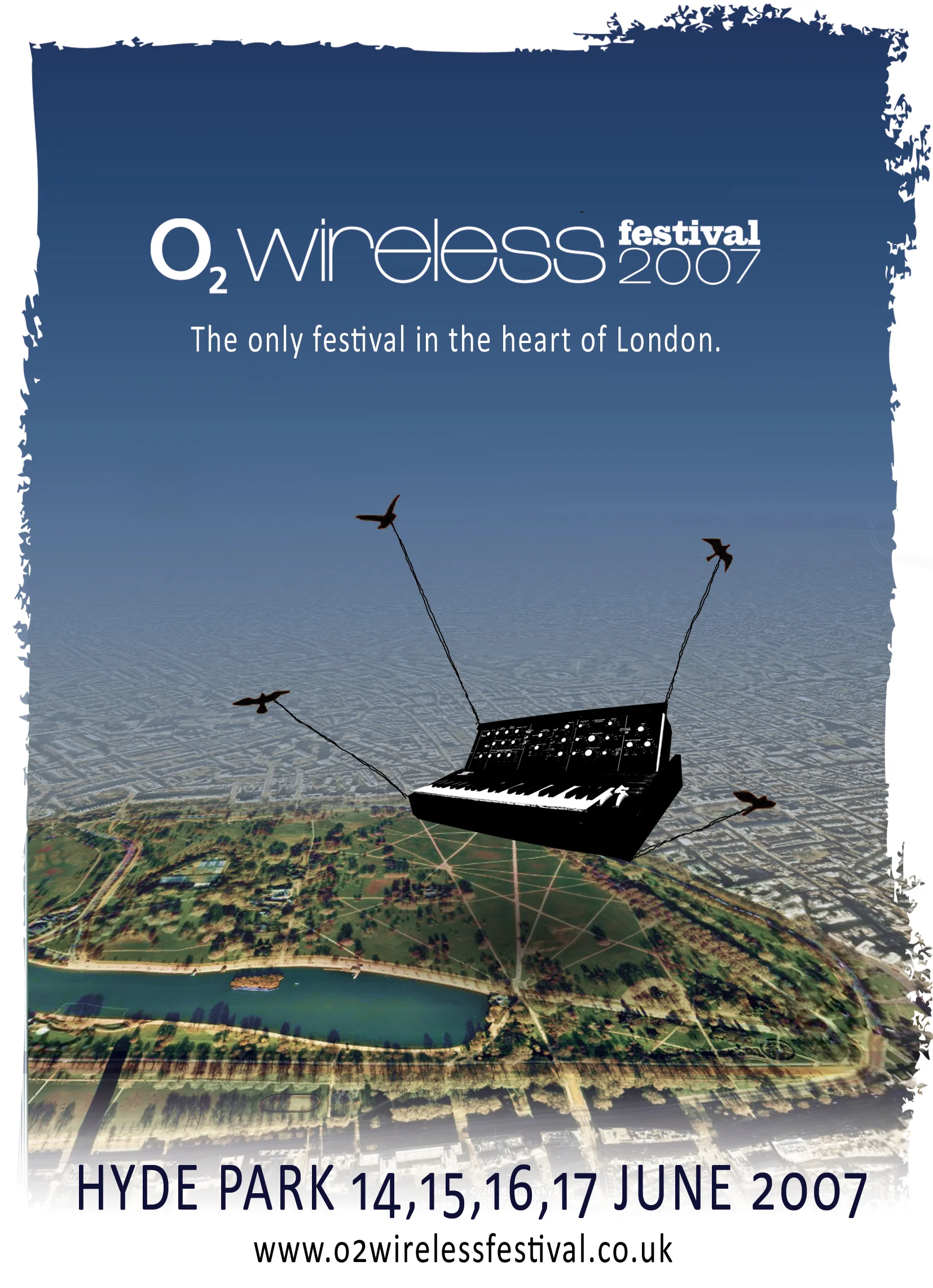
My unused design for the 2007 Wireless Festival
Wireframe of the first Latitude website
The finished Latitude site
A HTML email for Livenation promoting a Coldplay presale

April 2000
Web Designer
Tools Used:
Macromedia Freehand & Flash, Adobe Suite, CoffeeCup HTML
Techniques Used:
Stakeholder Interviews, HTML Wireframing, User Testing
Making the Modern World site
I moved to Winchester to work on a treasury funded project between The Science Museum and a local sixth form college. We turned the Making The Modern World exhibit into a series of e-learning modules written by teachers for A-level students. This was my first foray into e-learning and also prototyping. Back then we didn’t call it User Experience but we created the wireframe in HTML. We also designed and build numerous e-learning assets in Flash and illustrated lots of infographics to compliment the text.
The hand coded HTML wireframe of Making the Modern World


